Best Practises for Visual Design in UX
You’ve got 15 seconds to make a killer first impression, and it’s all about the visuals, baby! A clear visual hierarchy, intuitive navigation, and typography that guides users through your design are non-negotiables. Consistency is key, so pick a colour palette and stick to it. Don’t forget to make it accessible and inclusive, or you’ll alienate a whole chunk of your user base. And, spoiler alert, emotional connexion is not about being perfect, it’s about being relatable. Want to learn the secrets to crafting a visual design that’ll make users swoon?
Key Takeaways
• Establish an emotional connexion with users through empathy mapping, mood boards, and understanding their pain points, motivations, and desires.• Create a clear visual hierarchy through size, colour, alinement, and proximity to guide users’ attention to the most important elements.• Use typography to direct users through content, choosing a maximum of 2-3 font families and using font sizes to create hierarchy.• Develop a consistent colour palette that evokes the desired emotions and conveys a brand’s identity, using a mood board to distil the essence into 3-5 core colours.• Ensure accessibility and inclusivity by designing for users with disabilities, using readable and understandable ikons, and celebrating diversity in imagery.
Designing for Emotional Connexion

When you craft a UX that whispers sweet nothings to users’ emotional centres, they’ll forgive your app’s occasional quirks and luv you for it.
It’s not about being perfect; it’s about being relatable. You want users to feel seen, heard, and understood. That’s where empathy comes in.
Empathy mapping is a powerful tool to help you get inside your users’ heads (not literally, that’s creepy). By understanding their pain points, motivations, and desires, you can design an experience that resonates with them on a deeper level.
But how do you translate empathy into visual design?
That’s where mood boards come in. Think of them as visual representations of your brand’s personality. They’re a way to communicate the tone, style, and emotional vibe you’re aiming for.
Imagine a Pinterest board on steroids – a curated collection of images, colours, and textures that evoke a specific feeling. When done right, mood boards can help you create a visual language that speaks directly to your users’ hearts.
Balancing Aesthetics and Functionality

You’re probably thinking, ‘Aesthetics vs functionality – can’t they just get along?’
The answer is yes, and it starts with creating a visual hierarchy that makes sense.
Visual Hierarchy Matters
A whopping 55% of website visitors spend fewer than 15 seconds on a site before deciding whether to stay or bounce, making a clear visual hierarchy the secret sauce that keeps users hooked. You’ve got a tiny window to grab their attention, and a well-structured visual hierarchy is your best bet.
So, how do you create a visual hierarchy that converts? It’s all about Visual Prioritisation. You need to guide the user’s attention to the most important elements on your page. Here’s a quick cheat sheet to get you started:
| Visual Hierarchy Element | How to Create It |
|---|---|
| Size | Make important elements larger, less important ones smaller |
| Colour | Use contrasting colours to draw attention, similar colours to group |
| Alinement | Aline elements to create a clear flow of attention |
| Proximity | Group related elements together to create a clear hierarchy |
Functional Beauty Wins
You’ve crafted a visual hierarchy that draws users in, but now it’s time to guaranty your design is both beautiful and functional, because let’s face it, a pretty face only gets you so far.
Aesthetic harmony is essential, but it’s not the only game in town. You need to marry form and function to create a design that’s both stunning and useable.
Think of it as a design evolution – your design should adapt to the user’s needs, not the other way around.
A functional beauty wins when it’s intuitive, accessible, and easy to use. It’s not about sacrificing aesthetics for the sake of functionality or vice versa.
It’s about finding that sweet spot where both coexist in perfect harmony.
Crafting Intuitive Navigation Systems

You’re about to create a navigation system that doesn’t make users want to pull their hair out – congratulations!
Clear labelling is key to a successful navigation system. ‘Learn More‘ doesn’t count as a clear label, sorry.
Use simple hierarchies and labels that actually make sense. This will put you well on your way to creating a navigation system that’s, you know, actually navigable.
Clear Labelling Matters
Your navigation system is only as good as its weakest label, and a single ambiguous term can send users spiralling into a vortex of frustration.
Don’t be that designer who thinks they’re being clever with vague labels, only to watch users struggle to find what they need. You know, the ones who think ‘Explore’ or ‘Discover’ are good enough descriptions for a navigation menu item. Newsflash: they’re not.
Clear labelling matters, folks! It’s not about being boring or uncreative; it’s about being kind to your users.
When you use concise and descriptive labels, you’re giving your users a fighting chance to navigate your site or app with ease. And let’s not forget about text legibility – make sure your labels are large enough to read and have sufficient contrast with the background.
You want users to focus on finding what they need, not straining their eyes to decipher your navigation menu. Remember, clear labelling isn’t only a best practise, but a courtesy to your users.
Simple Hierarchy Works
Now that we’ve banished ambiguous labels to the depths of design hell, it’s time to tackle the organisational chaos that can turn your navigation system into a hot mess.
Crafting an intuitive navigation system is all about creating a simple hierarchy that makes sense to your users. Think of it as a well-organised filing cabinet: everything has its place, and it’s easy to find what you need.
Group related items together: This is Information Architecture 101. By grouping similar items, you create a clear structure that’s easy to navigate.
Use a shallow depth: Don’t make your users dig too deep to find what they need. Keep your hierarchy shallow and sweet.
Make it consistent: Consistency is key to a well-designed navigation system. Stick to your structure and make sure everything follows the same rules.
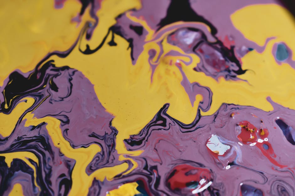
Selecting a Consistent Colour Palette

Crafting a consistent colour palette is like throwing a party – it’s all about creating harmony amongst the guests, and in this case, the guests are hues that need to get along. You want your colours to complement each other, not clash like your aunt and uncle at a family reunion.
A consistent palette is essential to establishing your brand identity, and it’s not just about picking colours you like. It’s about creating a mood that resonates with your audience.
To get started, create a mood board – a visual representation of your brand’s personality. Collect images, fabrics, or any other materials that evoke the emotions you want your brand to convey.
This will help you distil your brand’s essence into a few core colours. Remember, less is more. You don’t need a rainbow of options; three to five core colours are plenty.
And please, for the luv of all things good, don’t use Comic Sans yellow – it’s just too much.
When selecting your colours, consider the emotions they evoke. Cool tones like blues and greens can convey trust and calmness, while warm tones like oranges and reds can evoke energy and excitement.
Once you’ve settled on your palette, stick to it. Consistency is key to building a strong brand identity. Your users will appreciate the cohesion, and your brand will thank you.
Using Typography to Guide Users

Typography is like a road map for your users, directing them through the twists and turns of your content with carefully chosen font sizes, styles, and line spacing that says, ‘Hey, pay attention to this!’
It’s not just about making your content look pretty (although, let’s be real, it’s a nice bonus). Good typography is about creating a visual flow that guides your users’ eyes through your design. It’s about using font psychology to evoke emotions and create a connexion with your audience.
Choose a max of 2-3 font families: Any more and you’ll end up with a hot mess. Stick to a few fonts that complement each other and use them consistently throughout your design.
Use font sizes to create hierarchy: Make important stuff bigger, and less important stuff smaller. It’s not rocket science, folks!
Line spacing is your friend: Don’t be afraid to add some breathing room between lines of text. It makes your content way more readable and easier on the eyes.
Creating Visual Hierarchy and Flow
A well-crafted visual hierarchy guarantees that users focus on what matters most, and that’s where the magic happens. Think of it as a referee in a crowded room, directing the crowd’s gaze to the most important elements. You’re about to take your design to the next level by deliberately guiding your users’ attention with a visual hierarchy that screams, ‘Look at me!’
Visual weight refers to the amount of attention an element commands. The heavier the element, the more attention it grabs. You can adjust visual weight by tweaking factors like size, colour, and contrast. Make your call-to-actions (CTAs) pop by increasing their visual weight, and watch conversions soar!
Focal points are the secret sauce to a compelling visual hierarchy. These are the areas that draw users’ attention, and you can create them using visual cues like arrows, ikons, or bold typography. Strategic placement of focal points guides users through your design, facilitating interaction with the most important elements. Remember, a clear visual hierarchy is like a treasure map, leading users to the treasure – your design’s ultimate goal.
Ensuring Accessibility and Inclusivity

By the time users with disabilities encounter your design, they’ve already overcome a multitude of obstacles, so don’t make them fight to use your product too. It’s your responsibility as a designer to make certain that your visual design is accessible and inclusive. Think about it: if your design is inaccessible, you’re basically telling users with disabilities that they’re not welcome.
Some key takeaways to keep in mind:
Use Accessible Ikons: Make sure your ikons are readable and understandable by everyone. Avoid using ikons that are too complex or rely on colour alone to convey meaning. Instead, opt for simple, high-contrast ikons that can be easily understood by users with visual impairments.
Incorporate Inclusive Imagery: Your imagery should reflect the diversity of your users. Avoid using stereotypical or offensive images that might alienate certain groups. Instead, opt for inclusive imagery that celebrates diversity and promotes empathy.
Don’t Forget About Color-blind Users: About 8% of men and 0.5% of women have some form of colour vision deficiency. Make certain your design is accessible to them by avoiding colour-based information and using high-contrast colours.
Conclusion
As you wrap up your design, remember: it’s not just about looking pretty – it’s about crafting an experience that resonates.
So, did you create something that whispers ‘I get you‘ to your users, or did you just slap some fonts and colours together?
If it’s the former, congrats! You’ve nailed visual design.
Now, go forth and make users swoon.
Contact us to discuss our services now!